Alton Kim's Assignment Submissions
Storyboard and animation description
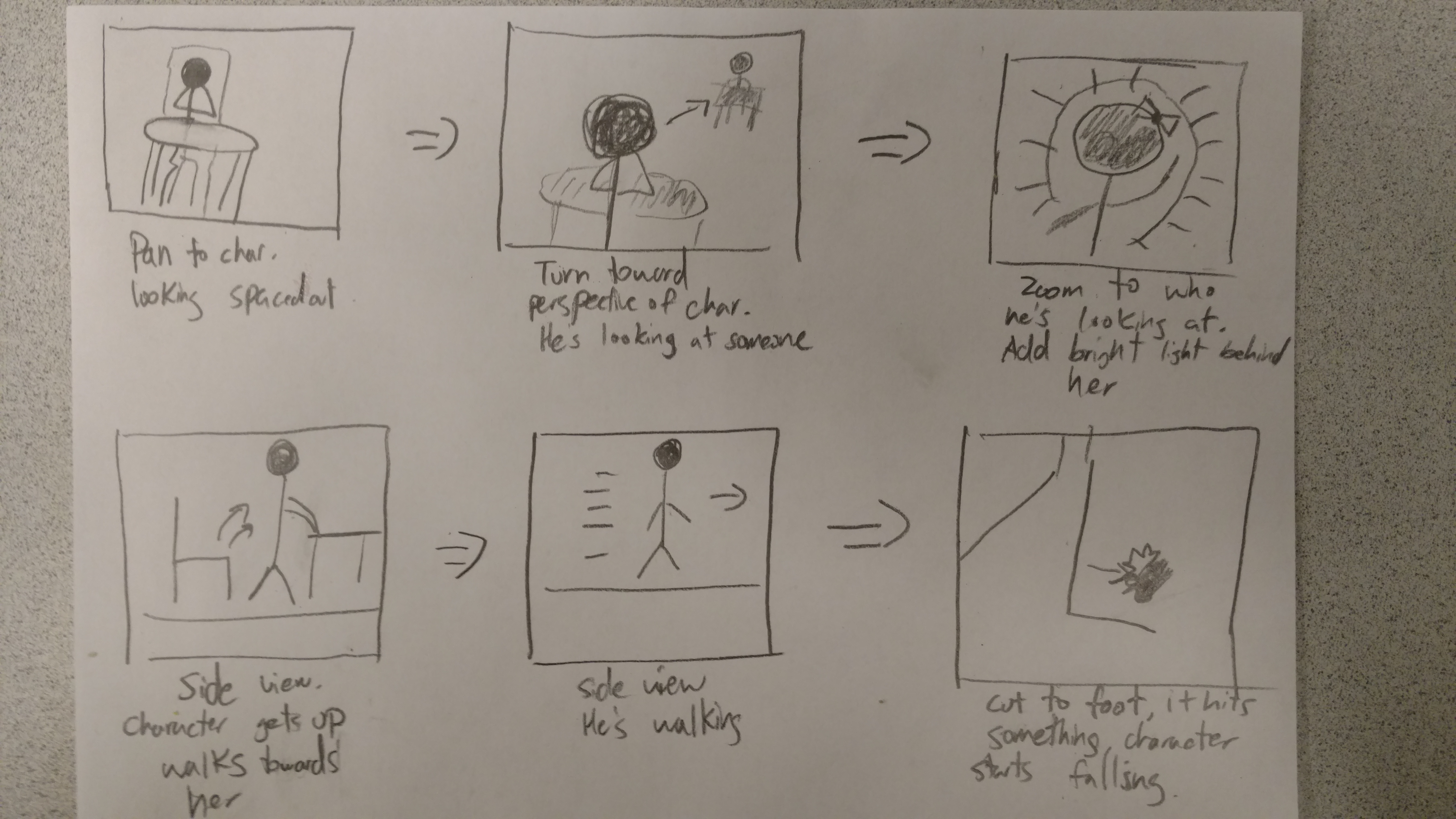
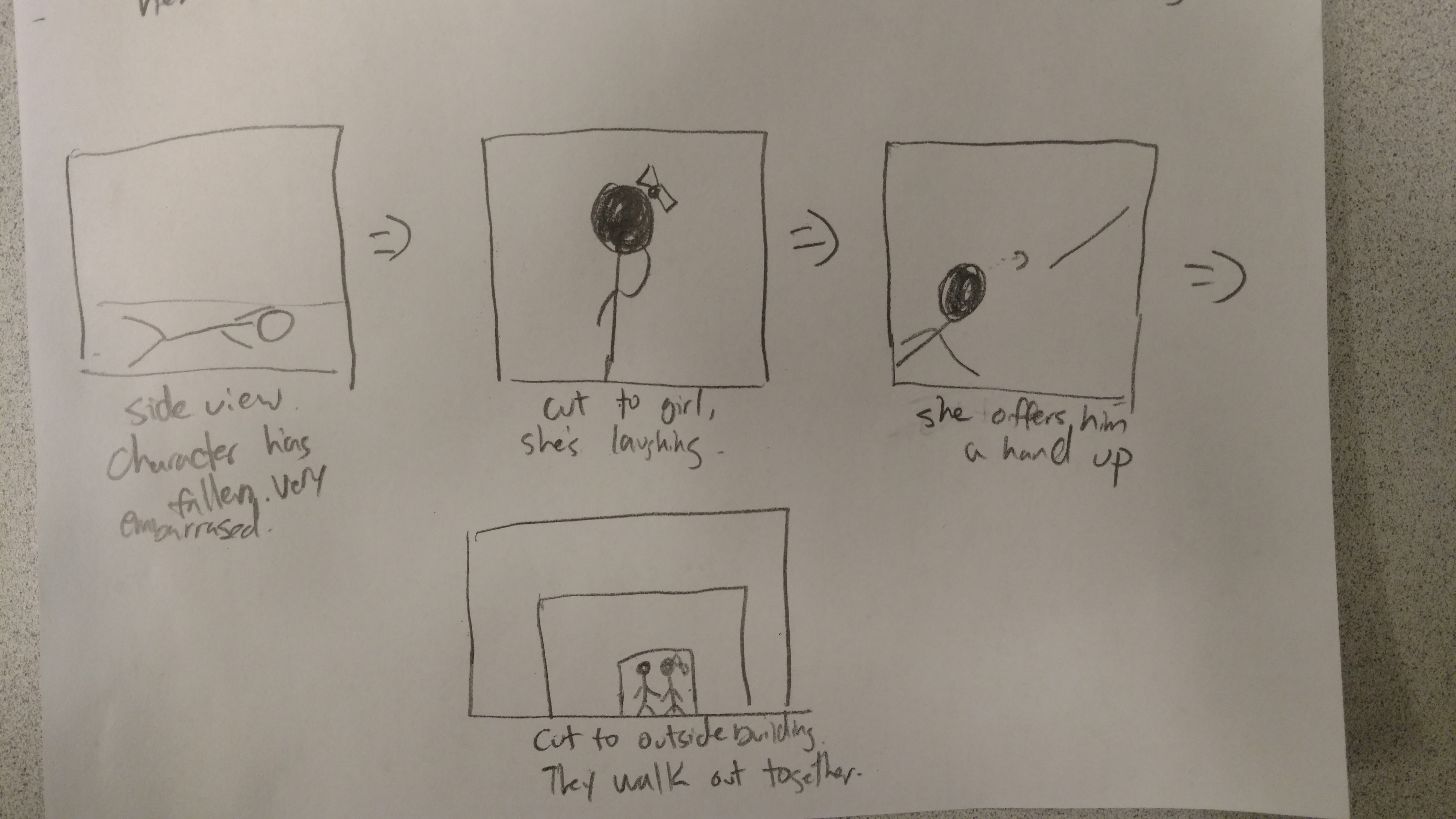
Below is the storyboard I made up for my short animation. Initially this started very small scale as it was just me working on the project. The boy robot would see a girl robot, and fall in love. He would then embarass himself by tripping. The girl would find the action cute and eventually go out with the robot. The setting was a bar or simple coffee shop and I wanted romantic music in the background. However, others joined my group, we felt as though we needed to be more ambitious with the project, resulting in a much more diverse set up. Much of the story has changed, but the core idea of a robot in love was kept. Sean took over the scene layout and Edward and I did the animation of the robots.
Team Responsibilities
Alton Kim: The Characters
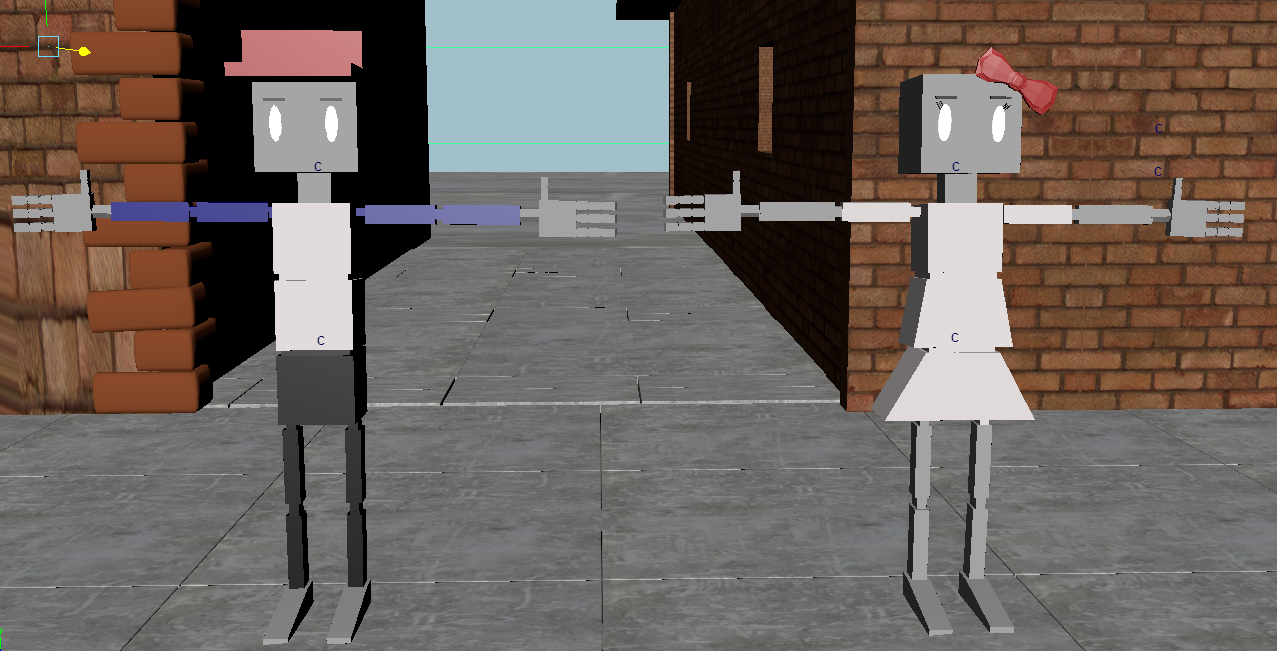
I rigged and modelled the characters myself. The only thing not modelled by me is the bowtie on top of the girl character's head. I went for a simple yet understandable design. I wanted to avoid the work of smooth binding skin so I went for a more cartoon, robotic astetic that would make rigging and animating them easier.
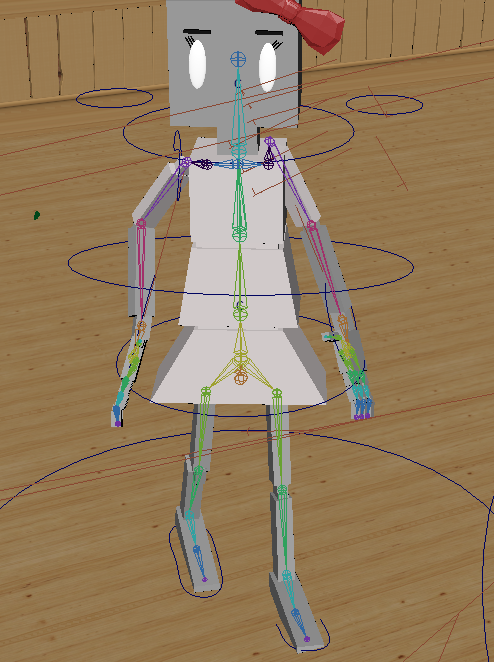
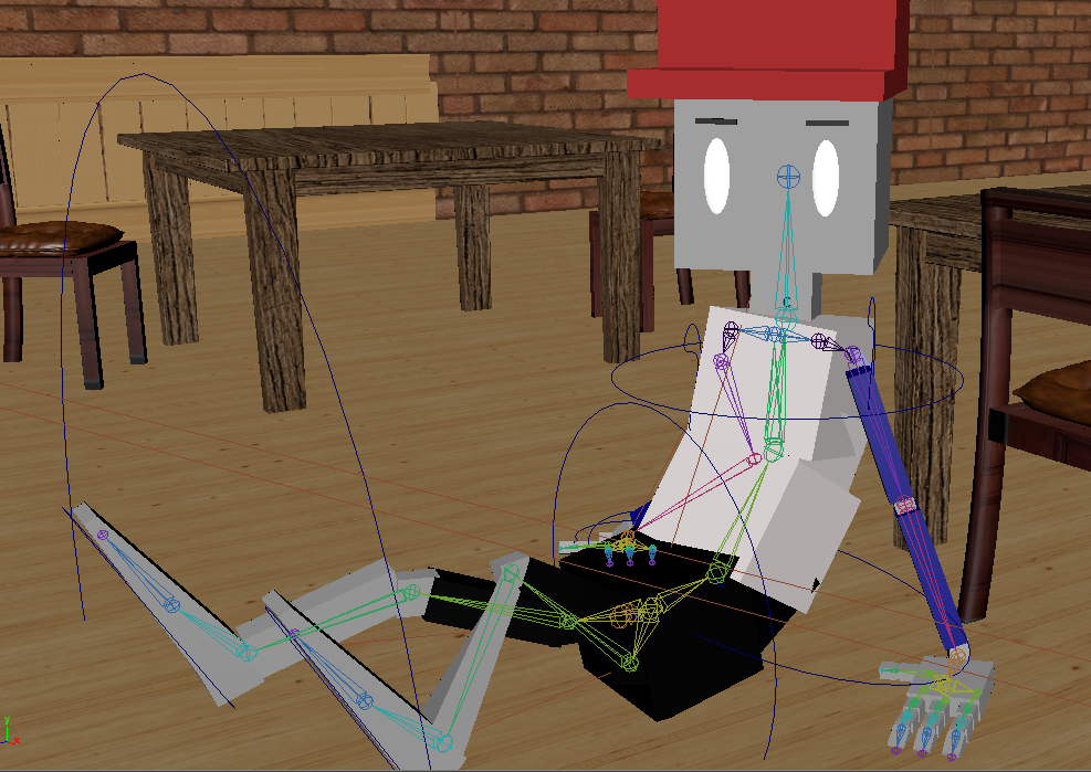
I rigged the characters up as well. After creating a working skeleton, using FK was difficult to animate the characters. Although it gave much more precision and realism while working, it took too much time. That is why I created IK handlers through important joints throughout the character's body. Controling these IK handlers were difficult to manage, so simple NURB curves were used to control individual IK handlers to create more stable animation. This was a difficult process and took a lot of time to get the joints to properly move and bend the right way.
Sean Boland: The Scene
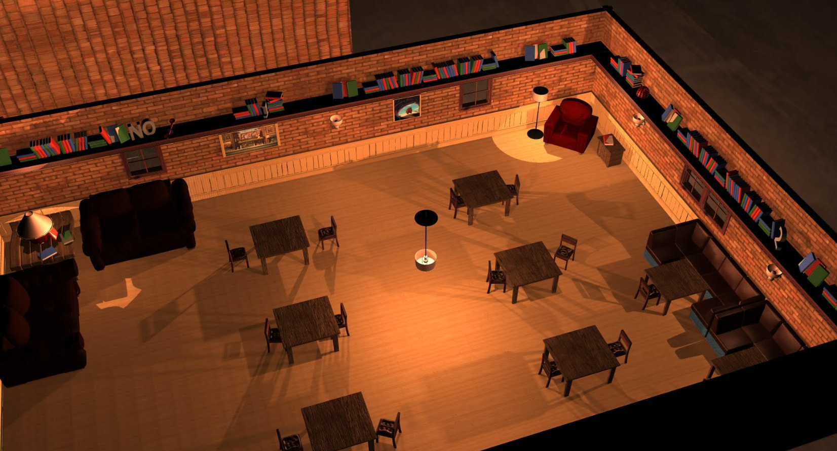
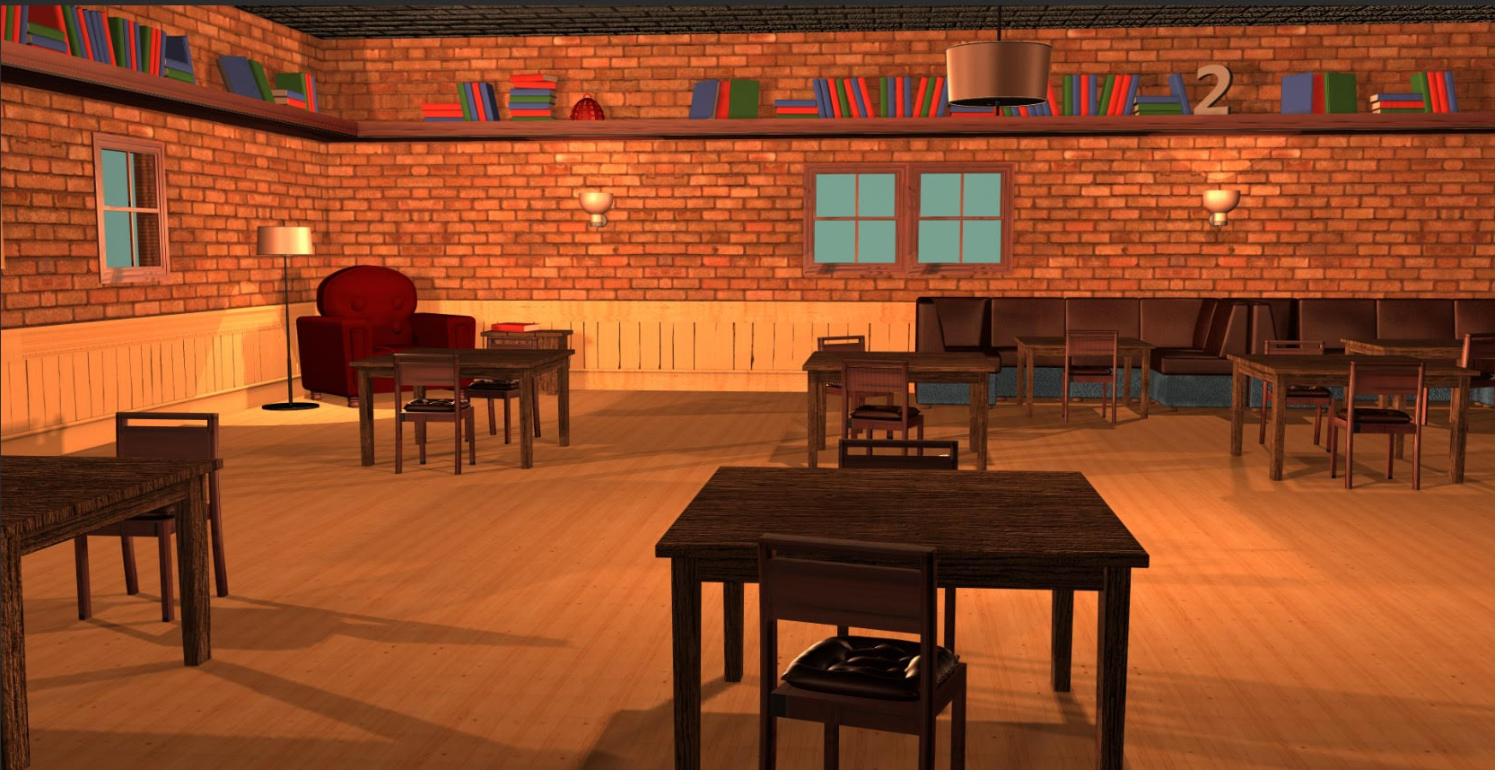
I worked primarily on the setting and backdrop. I spent most of my time building the cafe around the animation and getting it to look nice with custom shaders and textures. Most of the furniture models we used were from previous projects or modified from online sources (https://mzpstudios.blogspot.com/ and http://open3dmodel.com/download/white-sofa-fashion-3d-max-model-free-people_19508.html). I also decorated the area outside the cafe, as well as created all the lighting. Besides that, I also helped out with planning the animation and story, and testing how the characters should move. Not to mention my invaluable moral support (and threats to play Hearthstone on his account) that kept Alton awake past 4AM.
Edward: The Nightmare
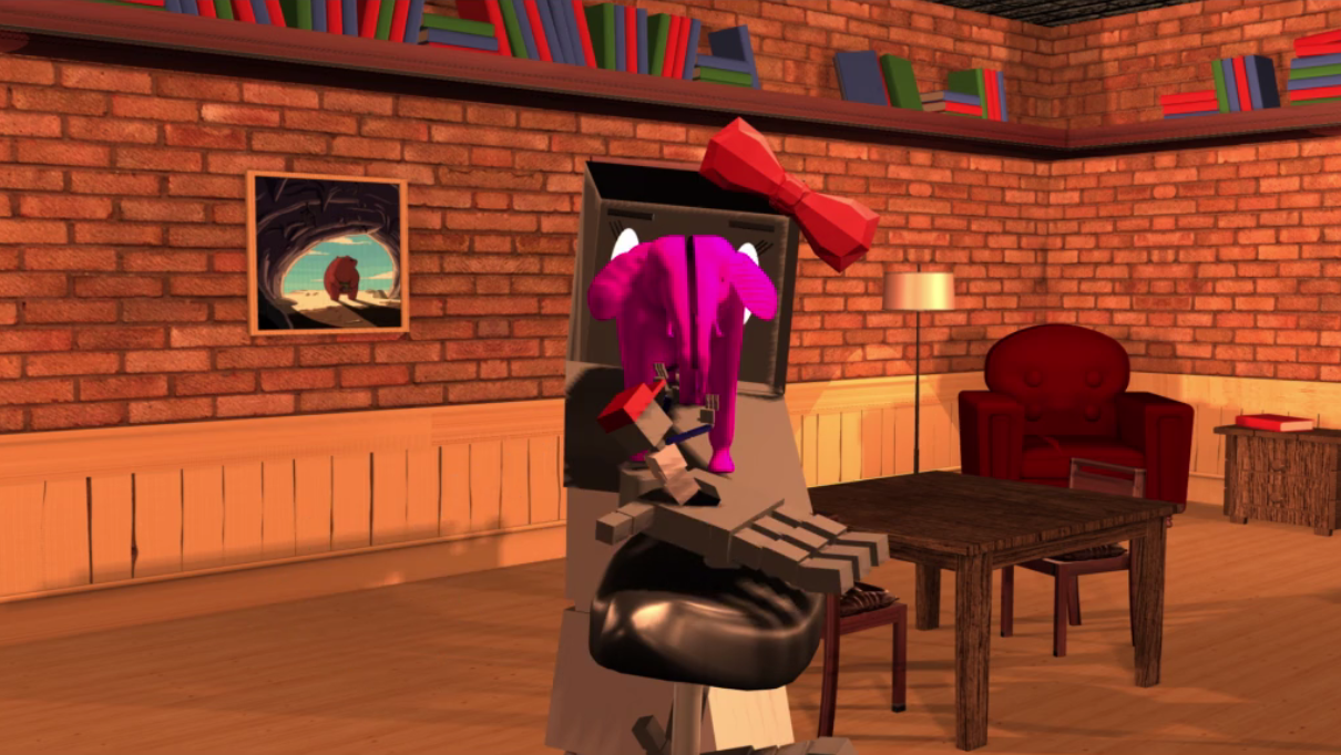
For this project I was in charge of the dream sequence after Mr. Robot gets knocked out and the ending. The dream sequence opens with Mr. Robot lying on his back eyes aswirl when Ms. Robot reaches down to help him up. There is a lens flare effect here from the ceiling lamp that adds a the dream like quality of the opening shot. He is helped up and is staring into the eyes of Ms. Robot when her face fold down and hiding in her robot skull is mr elephant!. Mr robot jumps back in fright but Mr. Elephant summons an arcane unicycle to blast Mr. Robot with a shrink bolt! Then he summons Mr. Robot towards him and eats him.
The ending shot was much more simple. Mr. and Ms. Robot are walking towards the door, the camera zooms in on Ms. Robot, and she quickly turns around showing that she has an elephant trunk! The twist ending helps tie the animation together blurring the line between what the audience thought was dream and reality.
Final Animation
Storyboard and animation description
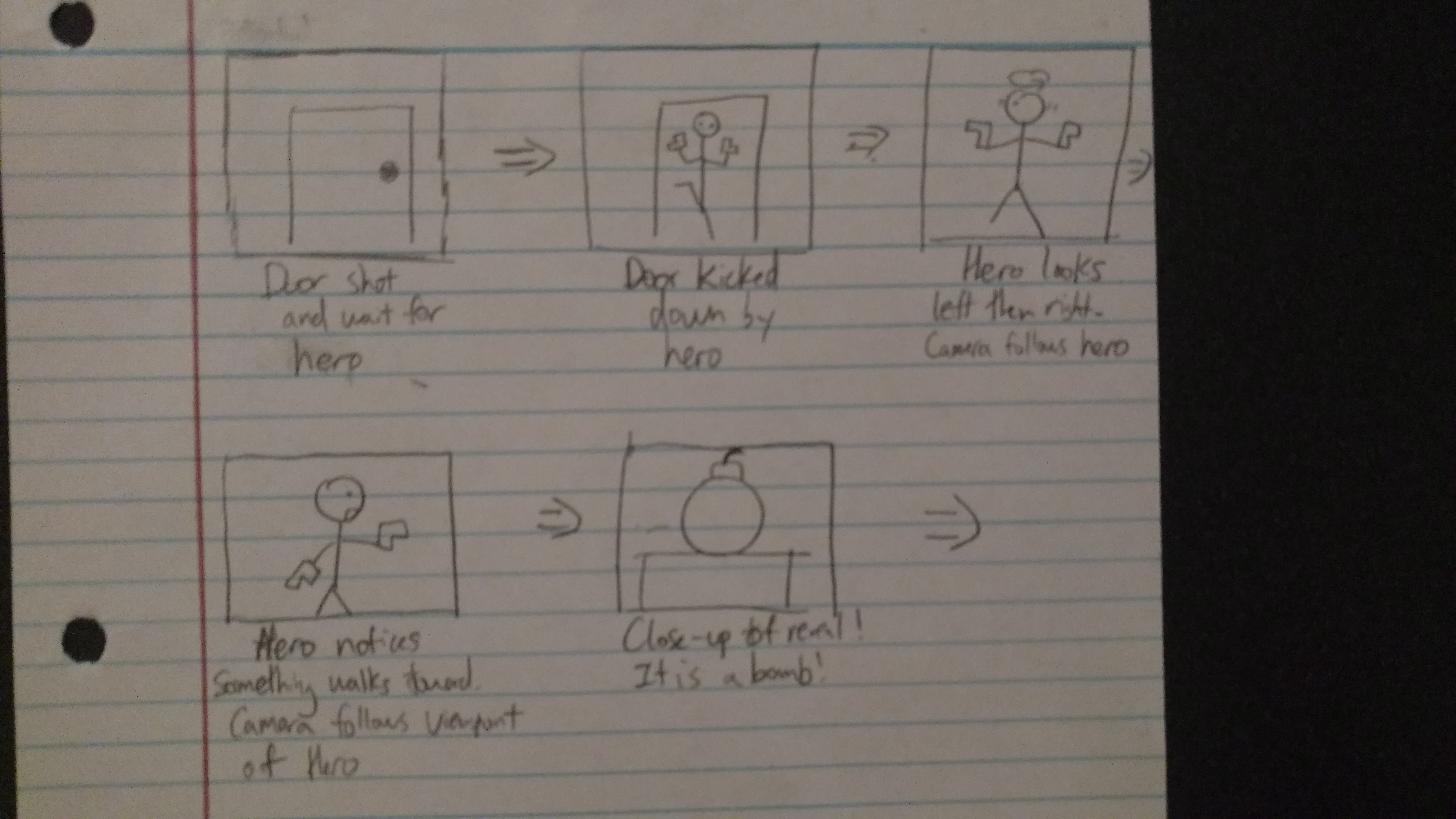
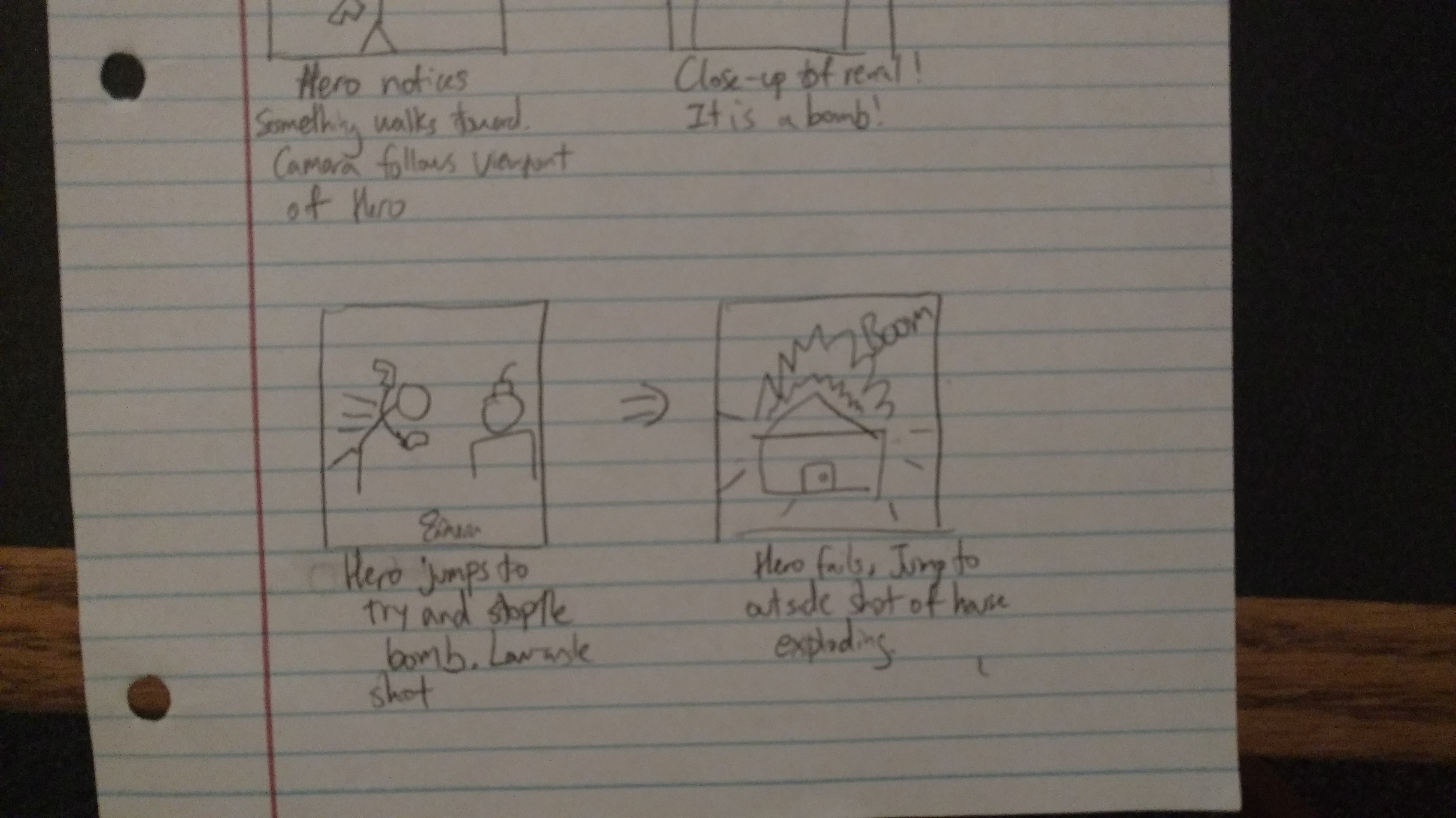
Below is the storyboard I made up for my short animation. The animation actually turned out mostly what I envisioned. The only thing was that the character movements were much more difficult to modify and change than anticipated. To summarize the storyboard, the hero kicks down a door and looks for trouble. He finds a bomb and tries to jump on it, but eventually fails.
Intreasting Aspects
Correcting the Motion Capture
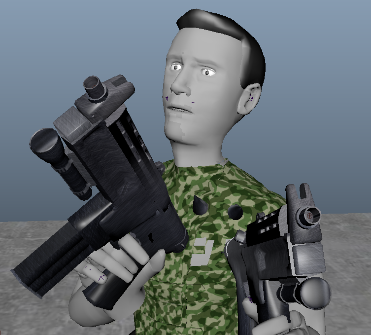
This was by far the most time consuming of the project. Using the joints of the skeleton, key frames, and graph editor, I tried as best I could to arrange the skeleton to my liking. I was going for a head-strong, not very smart, heroic superhero. I hunnched him a bit, and I also made it so he's holding his two submachine guns in a very poor fashion. Was really inspiried by Rambo.
Staging and Reveal!
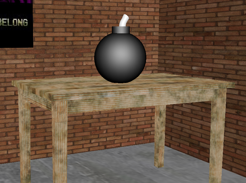
I wanted to make a cool effect in revealing the danger through various camera angles. At some point I even got a close up of the hero's eyes darting back and forth. In the end, however, I learned that the right staging can be very difficult if the animation is not built around it. For instance, I wanted a low angle shot of the hero, however, getting the hero to move accordingly was difficult and I ultimately had to scrape the idea. However, I tried to do it through subtle camera movements around the scene instead.
Explosion!
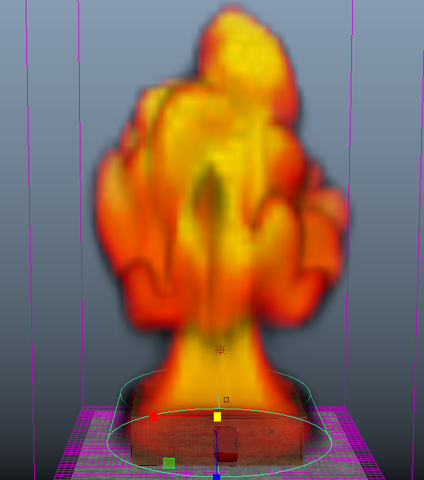
Explosion was something I did for fun to add extra effects and flair to my animation. The explosion was done through Maya Fluid dynamics and was suprisingly complex to create. Fuel, Turbluence, density values, and many other values had to be tweaked to make the desired effect, and the rendering time took longer than expected. However, it was a great learning expierence to play around with Maya Fluid dynamics and the end result looks ok!
Final Animation
Storyboard and animation description
Below is the storyboard I made up for my short animation. The animation differed slightly from what I wanted and planned out. I ran into much more errors and roadblocks then I would have thought. Maya Dyanmics can be tricky to handle and if misused can crash one's computer easily. There are no particle effects such as wall breaking, smoke, and fireworks like originally planned as it took much more time than intially thought.
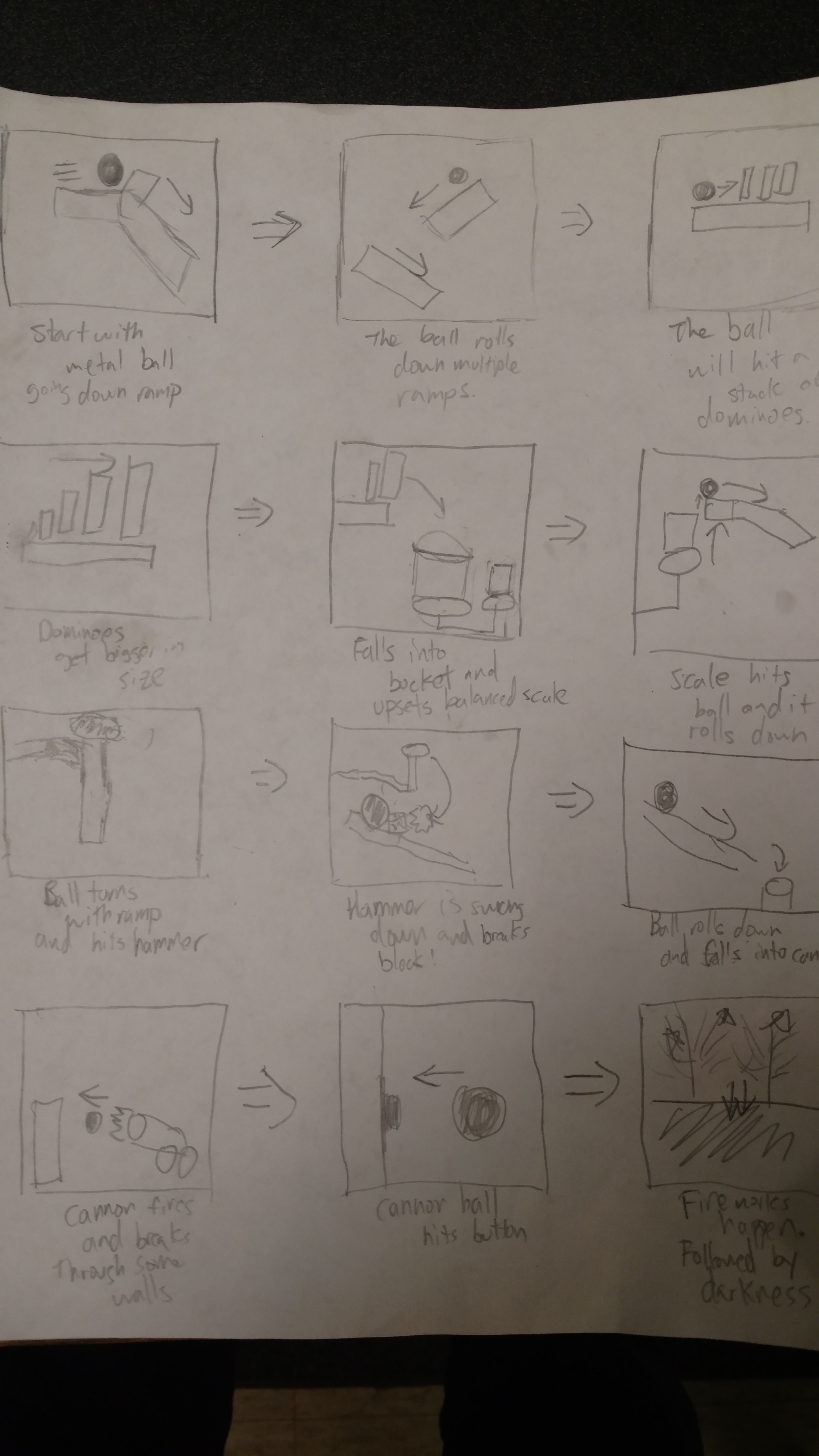
The Five Machines
Ramps
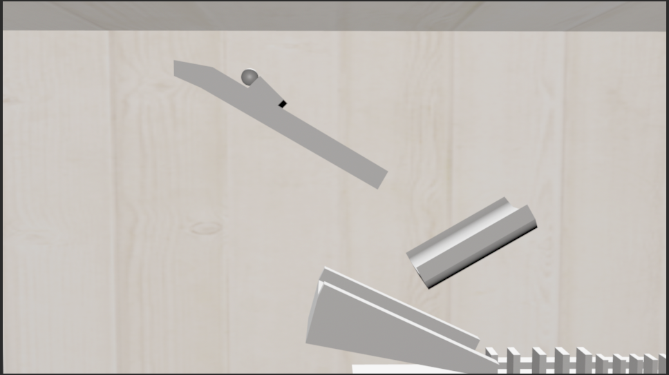
The ramps are the bread and butter of the rube goldberg animation. Many of the other machines use the ramps as a way to activate them.
Dominoes
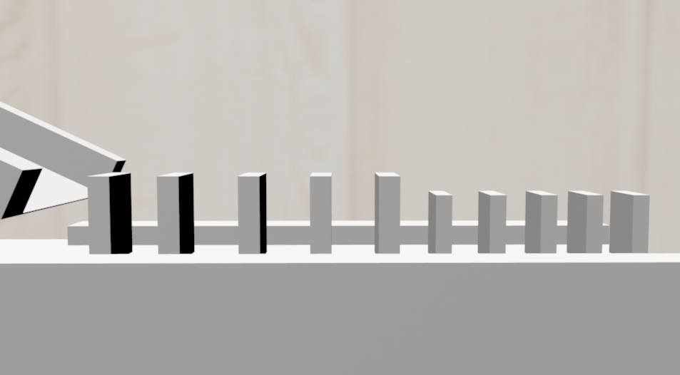
Dominoes were suprisingly difficult to do. When hit in the wrong spot, the dominoes would slide instead of falling. This required special planning in placement. Center of mass and friction were slightly altered to help the dominoes fall over.
Scale and Bucket
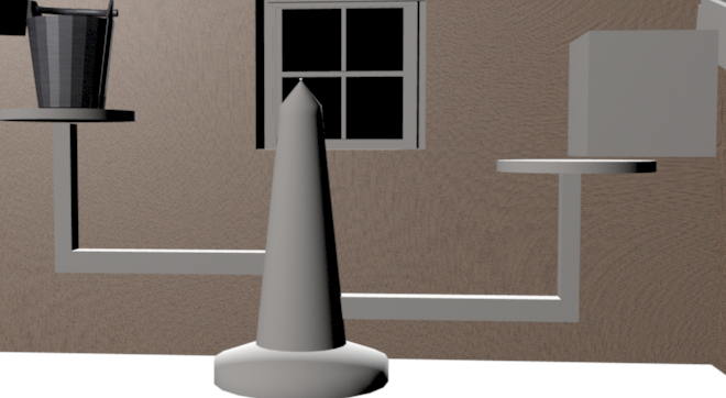
The scale and the bucket were modeled by myself. The scale and bucket were animated with both rigid bodies and keyframes. One important thing to note is that passive rigid bodies like the scale can be difficult to animate, so it is better to animate before adding in the rigid bodies for the best effect.
Axe
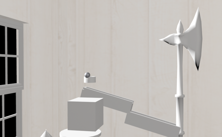
The axe was downloaded and altered slightly for this project. It pushes a ball by hitting it to the cannon. Initially it was made to be flung and cut rope. However, the creating dangling rope was also an endeavour too great. Credit goes to TurboSquid for making the model.
Cannon
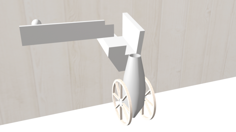
The cannon was modeled by myself. Intended to use with smoke and fireworks. However, it became the last step of the process since the other effects were too difficult to accomplish.
Final Animation
Storyboard and animation description
Below is the storyboard I made up for my short animation. The animation is a story of a unicycle running from a huge boulder hurtling towards it. In the end, the unicycle tries to outsmart the rock but ends up squashed anyways. I tried to incorporate music and timing while thinking of my storyboard as well. Sounds were ripped from the internet and put together in Window Movie Maker.
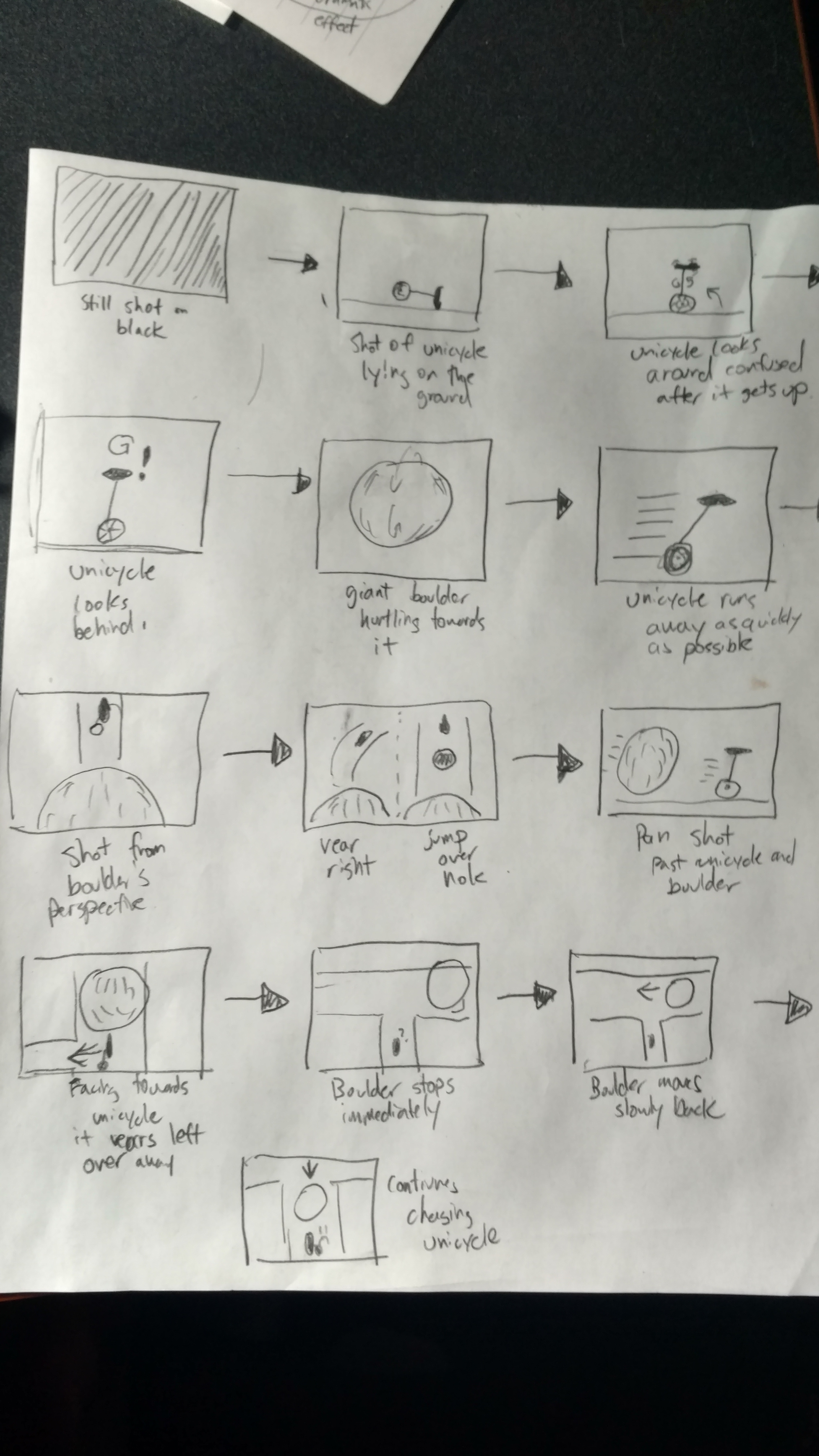
Three Principles of Animations Used
Anticipation
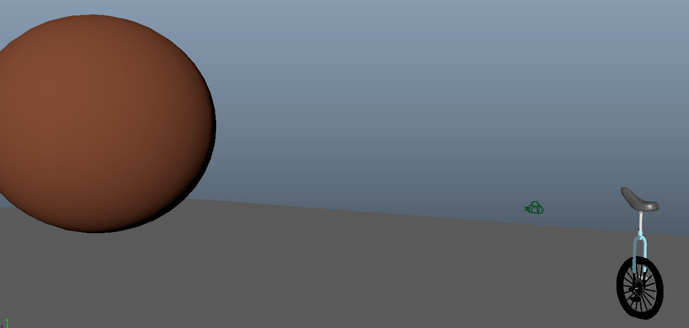
The principle of anticipation in the beginning and end of the animation. In the beginning, the unicycle is disturbed by a loud crash and slowly turns around alerting the audience of what is to come. Near the end of the animation, the unicycle comes to a intersection that vears left and allows the audience to prepare for a change of events ion the scene.
Staging
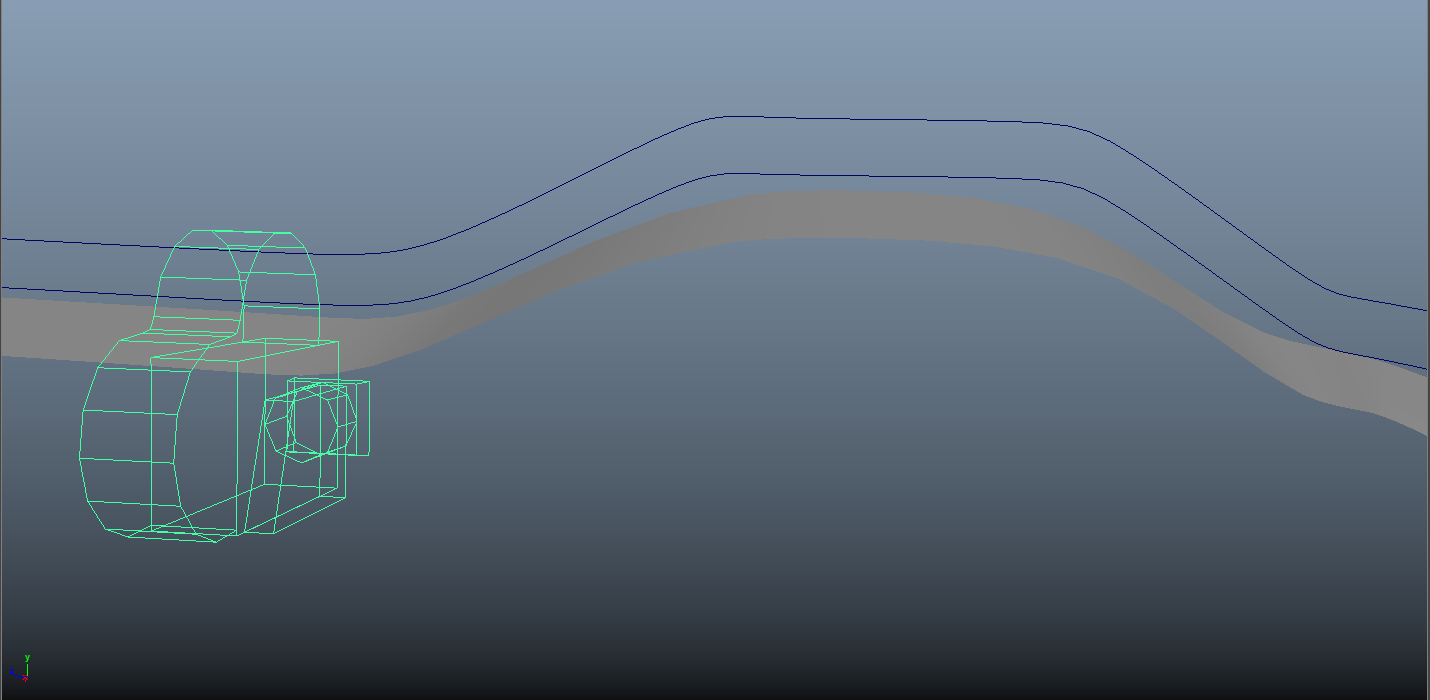
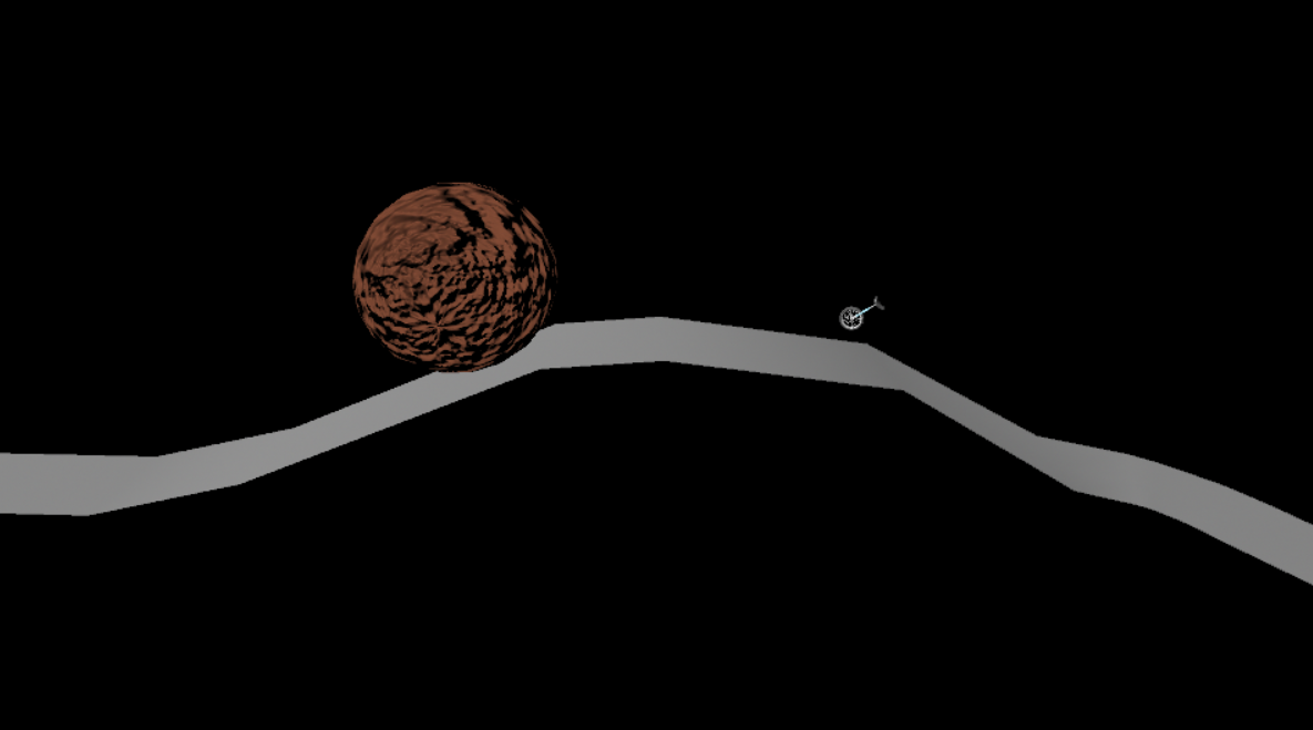
The principle of staging was used in this project through its camera placement. At the start, the camera placements help introduce both the character and conflict in the animation, being the unicycle and boulder respectively. The cameras are focused seperately on each one to prevent confusion. During the chase, the camera rapidly changed perspectives in order to keep pace with the fast action that was occuring.
Exaggeration
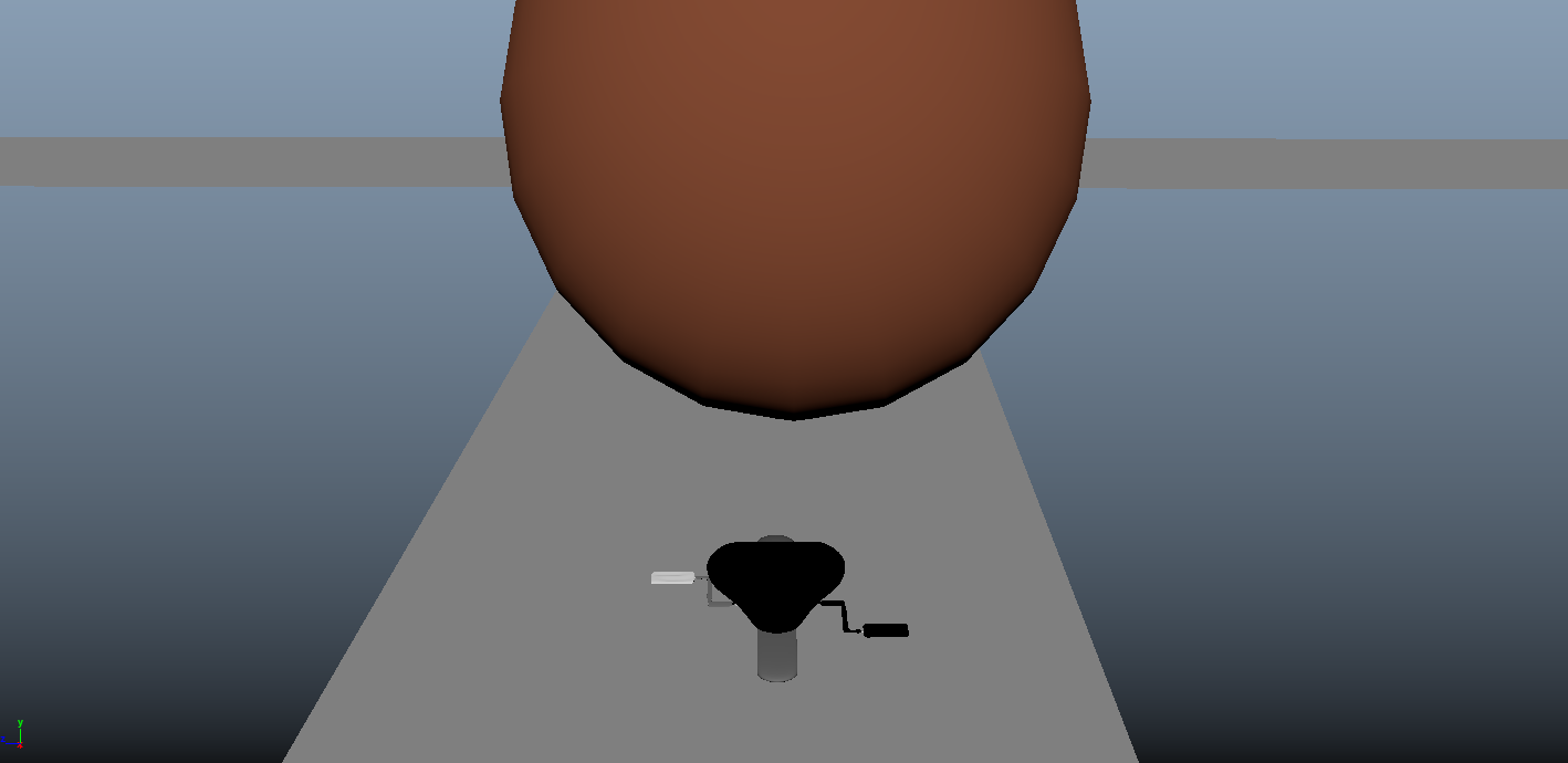
The principle of exaggeration was used to convey suprise when the unicycle jumps high in the air. It also used to convey the sense of defeat by flattening the unicycle when it gets squashed by the giant boulder.
Squash and Strech
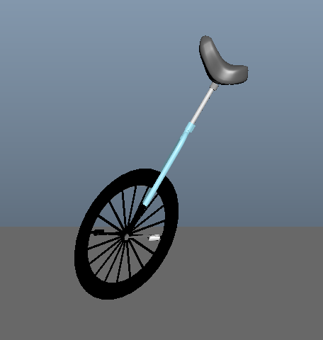
Squash and strech was applied to the unicycle to give it more depth and character. It allowed the unicycle to depict emotions such as panic and suprise, giving it more life. It also allowed for the unicycle to have more weight when jumping.
Final Animation
Storyboard and animation description
Below is the storyboard I made up for my short animation. The animation is essentially a Pokeball being thrown at a cutout of a Pokemon.
The beginning of the animation is a reference to when Pokemon have battles. In other words, the beginning of the animation was something reminiscent of a Western showdown with the camera zooming on the faces. This was a more ambitious project for me as I try to use everything I learned. (Turned out worse then expected)
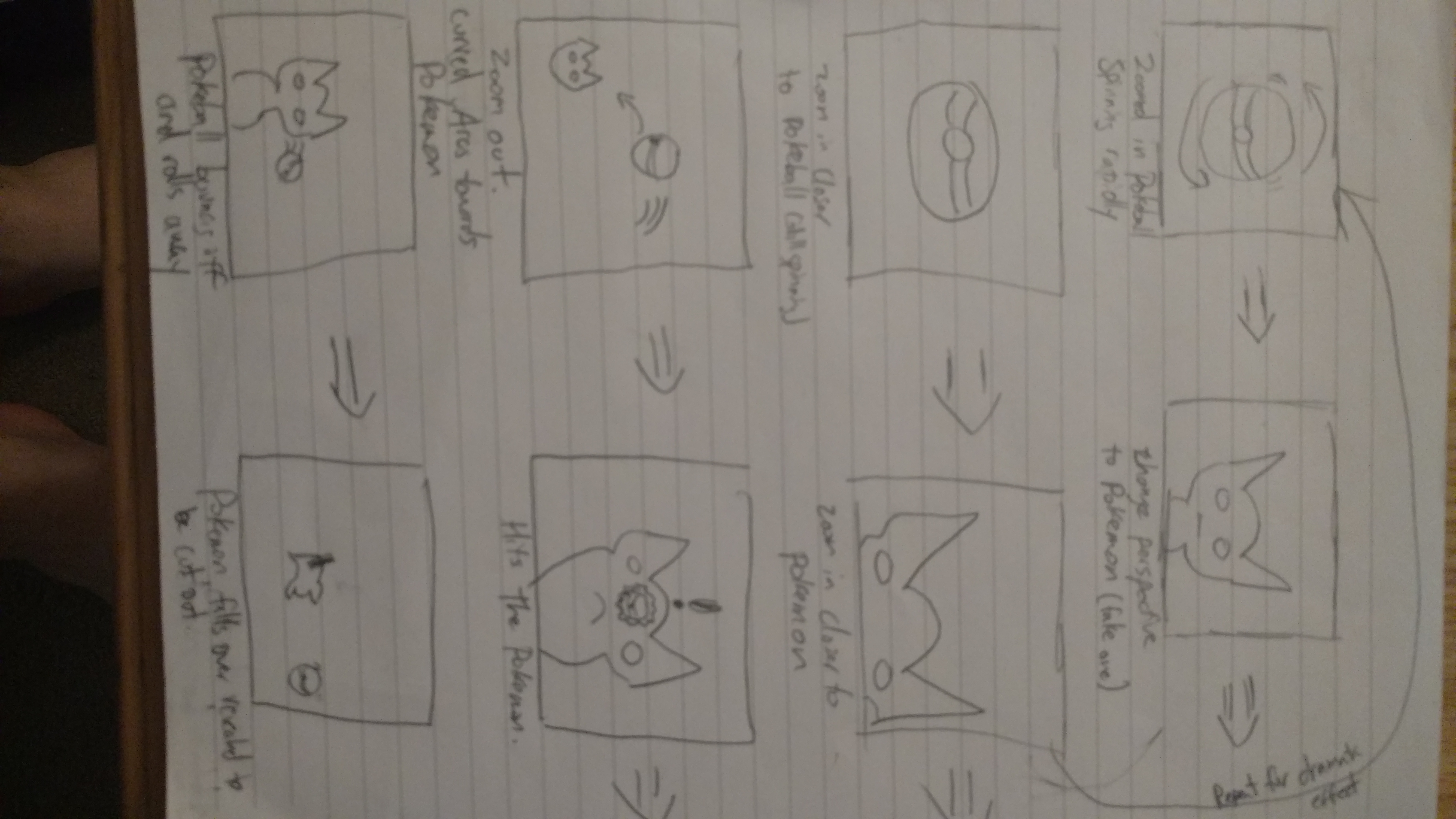
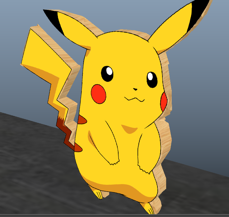
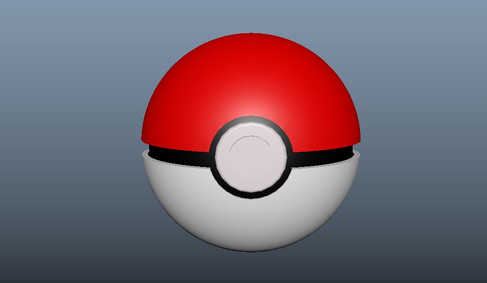
I wanted to make this special, so instead of finding models online I made my own! Below are my attempts at modeling the Pokeball prop and the Pokemon Cutout Prop.
Three Principles of Animations Used
Anticipation
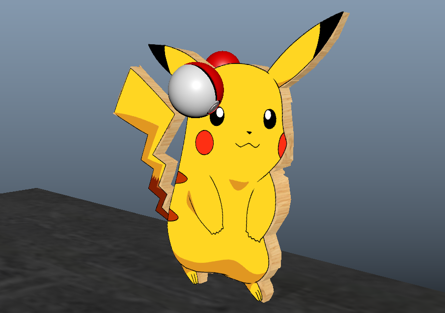
The principle of anticipation was used when cardboard cut out of Pikachu was hit by a pokeball. Subtle movements in the wobbling animation helps the viewer anticipate whats going to happen to the cutout. The rotations of the pokeballs also help convey where the pokeballs are going to bounce. Anticipation was also a huge factor as the build up in the beginning.
Staging
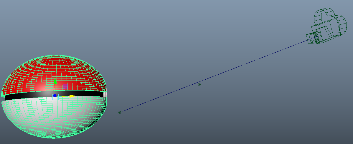
The principle of staging was used in this project through its camera placement. In the beginning the camera helps hide how the Pikachu is actually just a wood cut out. The zoomed in perspective gives less information to the viewer and in turn an oppurtunity to suprise them. Even till the end, the fact that the Pokemon was a cut out was hidden till the end.
Exaggeration
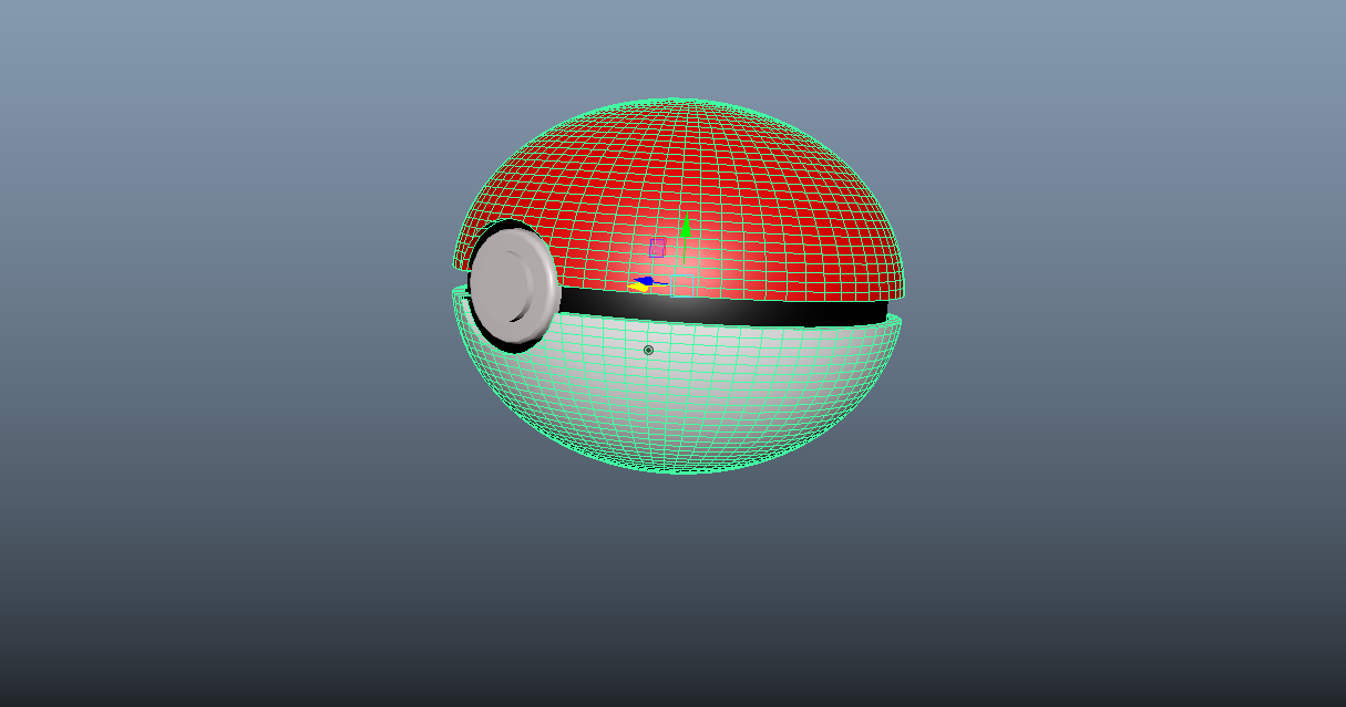
The principle of exaggeration was used in depicting the bouncing of the pokeball. Exepcially at the beginning the streched pokeball helps convey the sense that it is traveling at a remarkably fast rate. It helped convey the message while not making it totally unbelievable. Streching was also used sometimes to help create a more fluid motion.
Squash and Strech
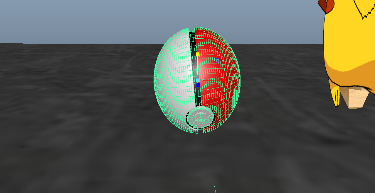
The principle of squash and strech was used subtly when impacting the ground and the pikachu frame. It helped with the overall flow of the animation.
Final Animation
Source Images of the B-12 Stealth Bomber
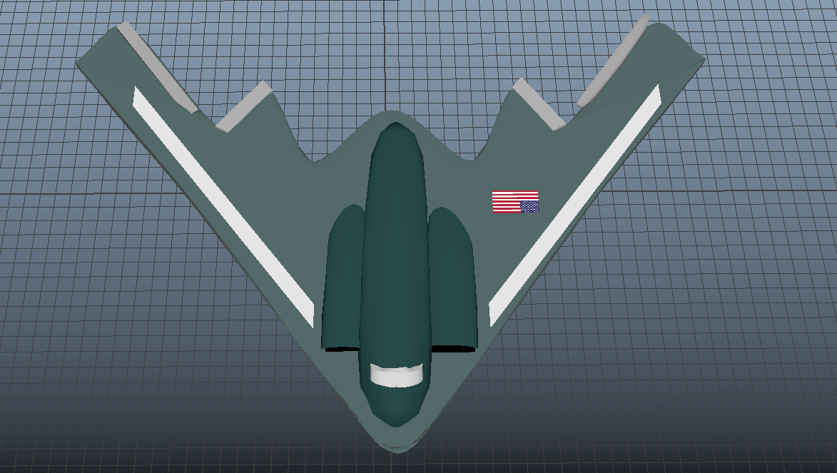
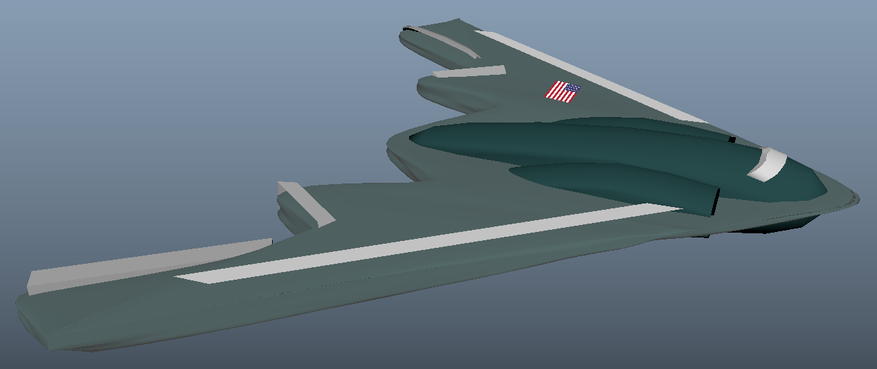
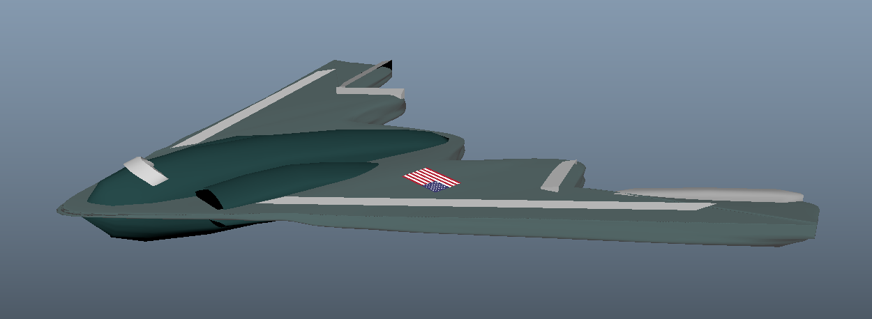
The B-12 Stealth Airplane are one of my favorite airplanes for its elegant design and how quickly it can travel , so I dedicated a project on it! (Even though I'm not the best artist)
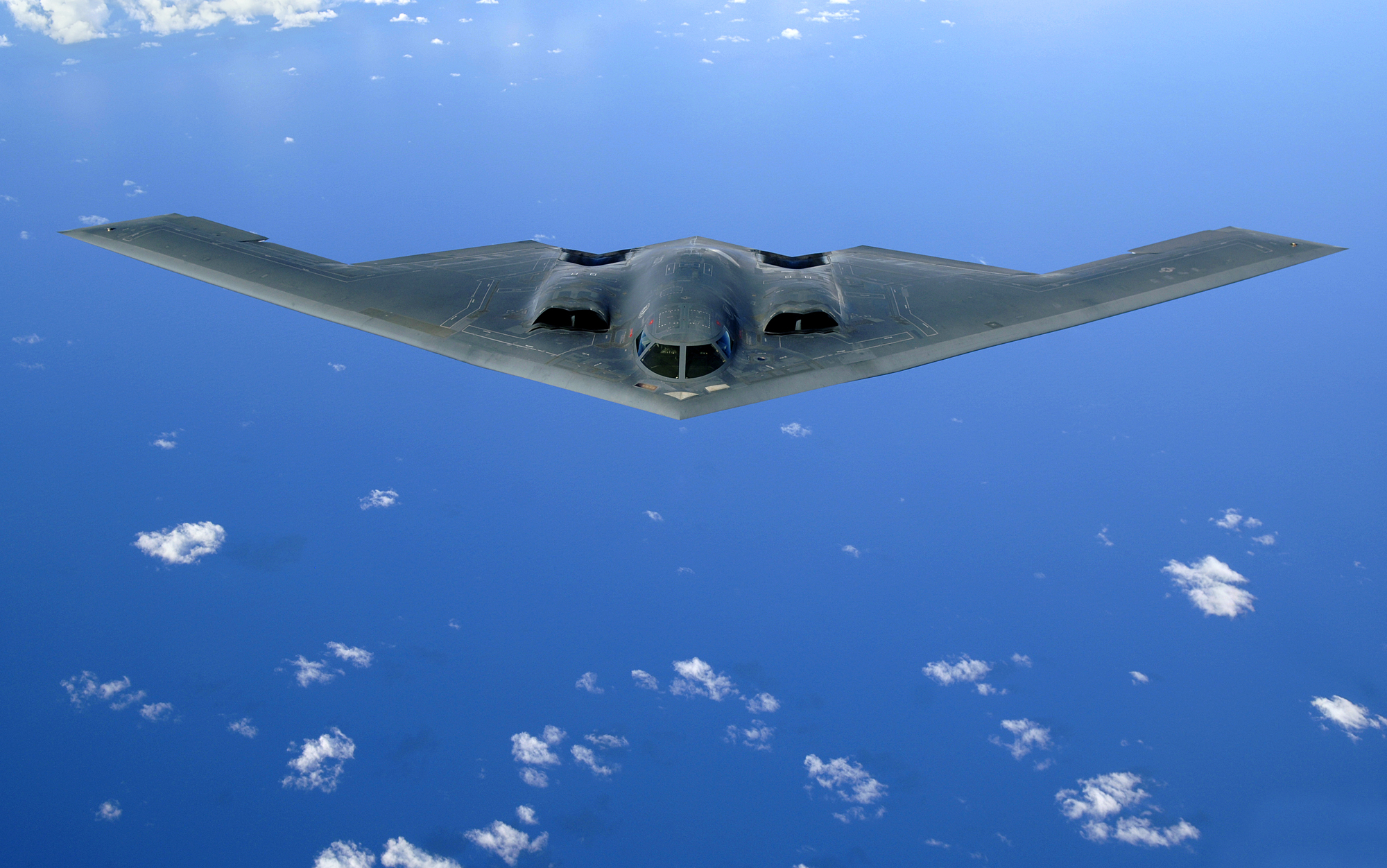
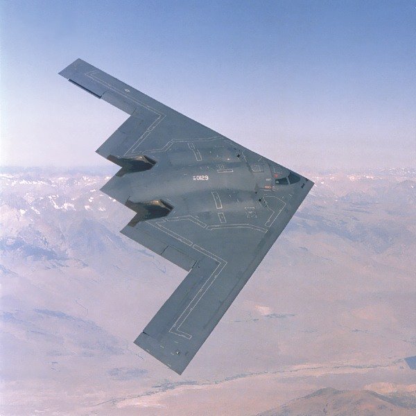
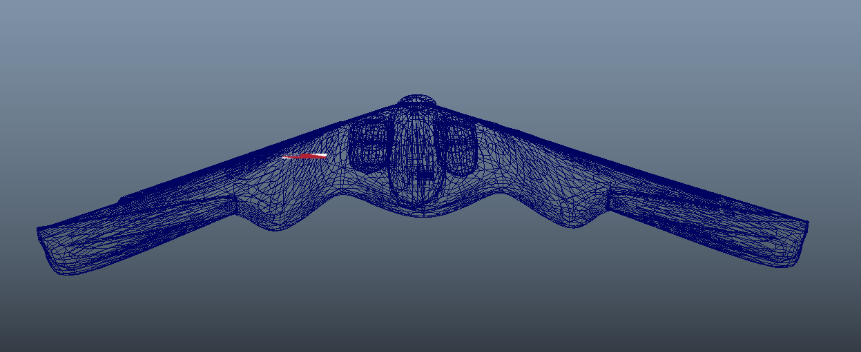
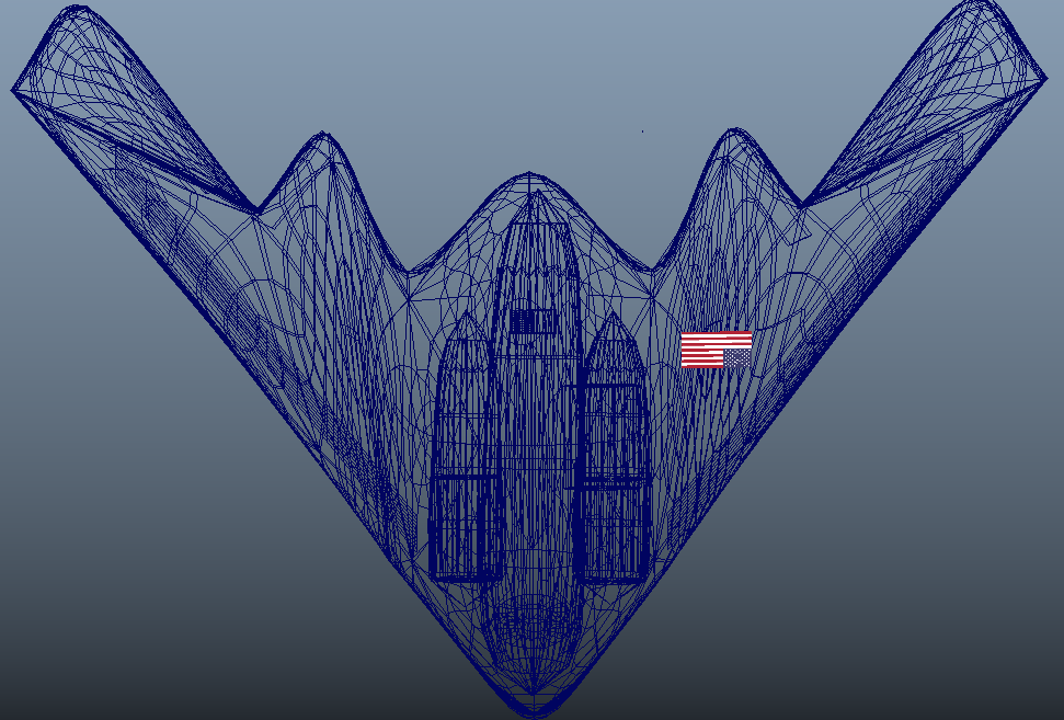
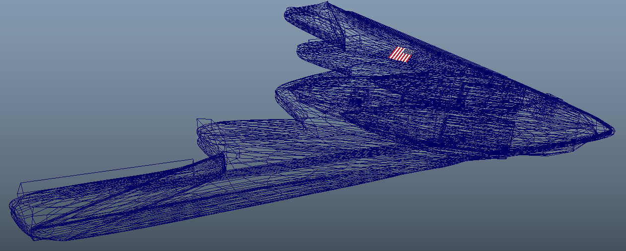
I utilizied many different primatives in making these shapes. Also used a combination of the extrude, poke, edge loops, bevel, multi-cutting, and smooth tool to help me make this plane. Although the plane looks simple, the wireframe can display a lot of different shapes going on in the plane. A lot of trial and error and learning was also required! But in the end looks good for a first time attempt! Below are the end results.
Shaded Pictures
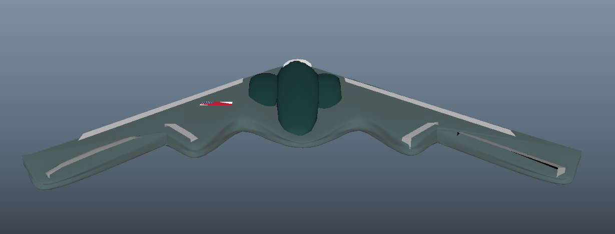
Wireframe Pictures

Shaded Animation
Wireframe Animation
Tutorial Version
Edited Version
Changes made...
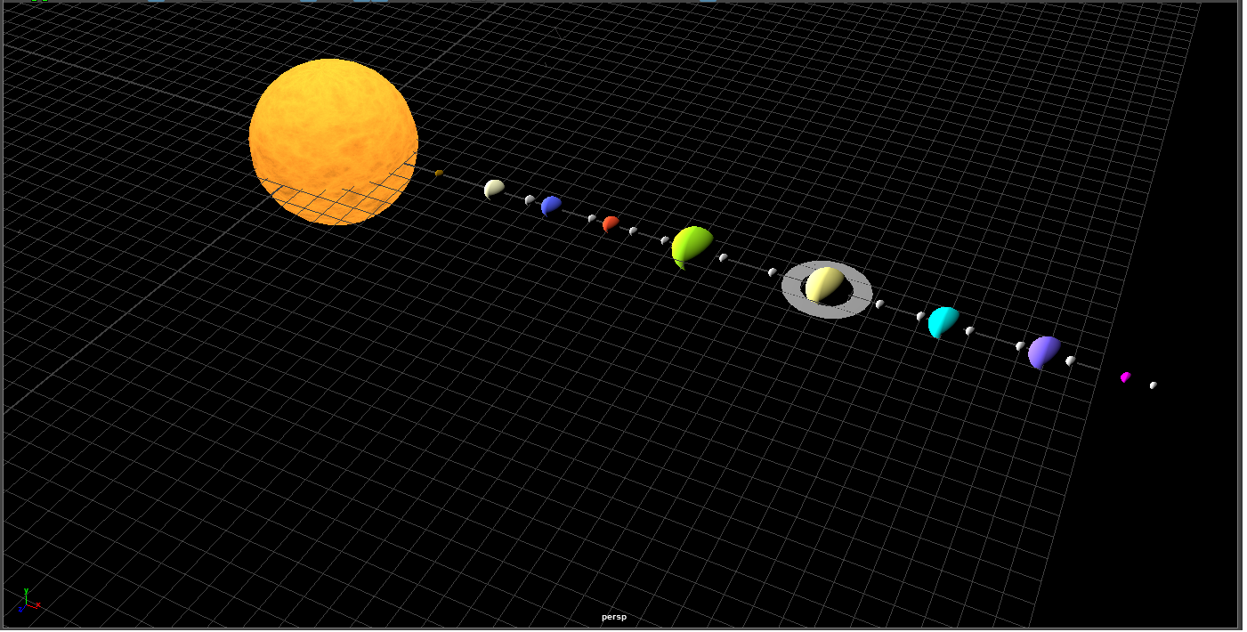
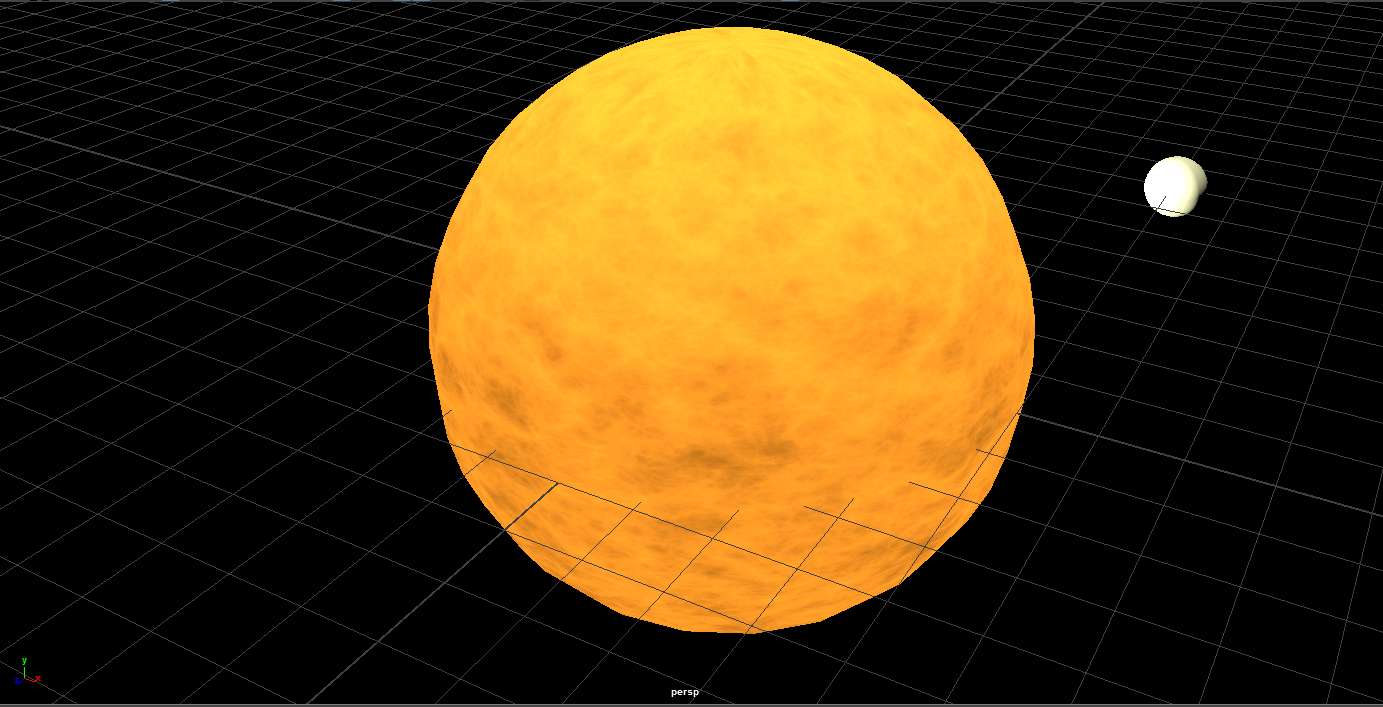
1) Changed Sun to have a fractal texture and added short animation to make the texture on the sun change based on time to make it more realistic
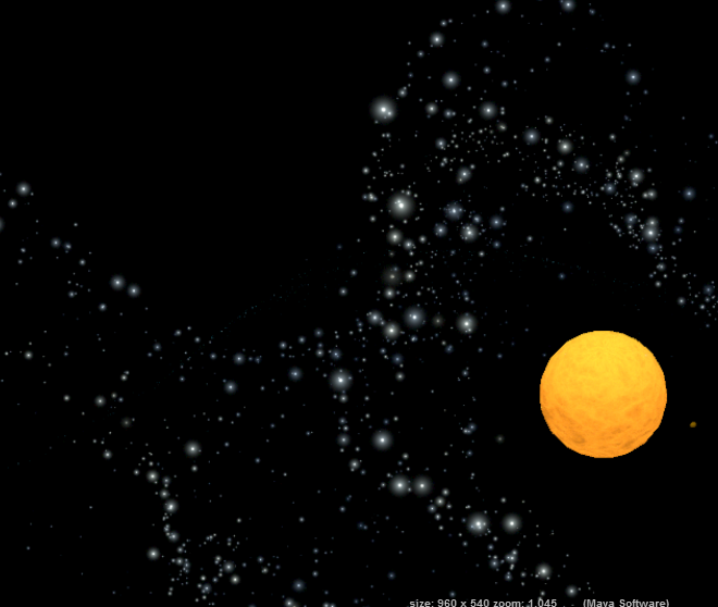
2) Created and rendered a background to show distant stars in space. Particle effects using the brush were used and displaced above the animation to create the effect.
3) Modified the orbit of the planets around the sun and spin of the planets to create a more intreasting visual
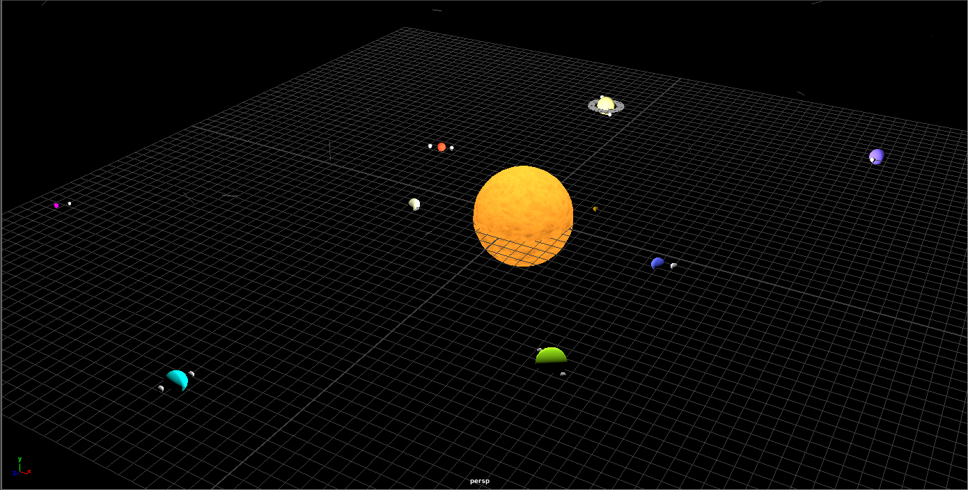
4) Added a point light source to try and replicate the sun's light and also added ambient lighting to light up the scene in a unique way.
